


How to Add Pie Chart in Powerpoint?
Presenting data in an easy-to-understand and visually appealing way is essential to any successful presentation. If you are looking for a way to make your slides more vivid and effective, adding a pie chart to your PowerPoint presentation is a great way to do this. In this article, we will discuss how to add a pie chart to your PowerPoint presentation quickly and easily. By following the simple steps outlined here, you will be able to add a pie chart to your presentation in no time.
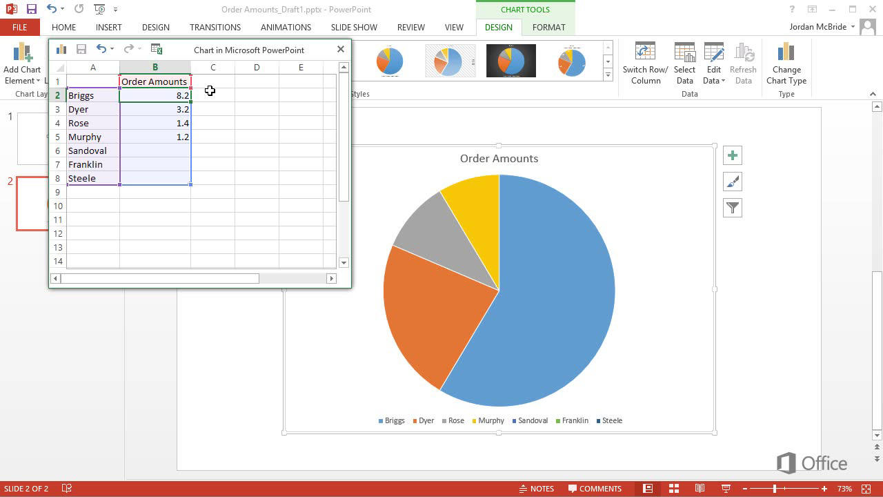
Adding Pie Chart in Powerpoint:
- Open Microsoft PowerPoint and select the slide where you want to add the pie chart.
- Go to the ‘Insert’ tab and select ‘Chart’ from the ‘Illustrations’ group.
- From the drop-down menu, select ‘Pie’ as the chart type.
- Enter the data to be represented in the pie chart.
- Once all the data is entered, click the ‘Insert’ button to add the pie chart to the slide.
- Customize the look and feel of the pie chart by clicking on the ‘Design’ tab.
Adding a Pie Chart to PowerPoint
The pie chart is one of the most widely used and versatile graphical representations of data. It is used to represent the sizes of individual components that make up a whole. Adding a pie chart to your PowerPoint presentation can help to illustrate data in a visually appealing and easy to understand way. In this article, we will discuss how to add a pie chart to a PowerPoint presentation.
Creating the Pie Chart
The first step in adding a pie chart to PowerPoint is to create the chart. This can be done by using the Insert Chart option from the Insert ribbon. This will open the Insert Chart dialog box, which allows you to choose the type of chart you would like to insert. Select the Pie chart option and click OK. This will open the Chart Editor, where you can enter the data that will be used to create the chart. Enter the data and click the Update button to create the chart.
Formatting the Pie Chart
Once the chart is created, you can format the chart to make it look more visually appealing. You can do this by using the Chart Tools ribbon. This ribbon allows you to adjust the colors, text, size, and other elements of the chart. You can also add labels to the chart to make the data more easily understandable.
Adding Labels to the Pie Chart
Once you have formatted the chart, you can add labels to the chart. This can be done by clicking on the chart and selecting the Add Labels option from the Chart Tools ribbon. This will open the Add Labels dialog box, which allows you to add labels to the chart. Enter the labels and click OK to add the labels to the chart.
Positioning the Pie Chart
Once the chart is created and formatted, you can position the chart on the PowerPoint slide. To do this, click on the chart and select the Move Chart option from the Chart Tools ribbon. This will open the Move Chart dialog box, which allows you to move the chart to any position on the slide. When you are finished, click OK to save the position of the chart.
Saving the Pie Chart
Once the chart is positioned, you can save the chart. To do this, click on the chart and select the Save Chart option from the Chart Tools ribbon. This will save the chart so that it can be used in future presentations.
Conclusion
Adding a pie chart to a PowerPoint presentation can help to illustrate data in a visually appealing and easy to understand way. Creating the chart, formatting it, adding labels, positioning it, and saving it are all easy tasks that can be completed with a few clicks of the mouse.
Frequently Asked Questions
What is a Pie Chart?
A pie chart is a circular graph that is divided into slices to illustrate numerical proportion. It is a type of graph used to visualize data, where each slice of the pie represents a category of data and its size is determined by the percentage it represents. Pie charts are commonly used to represent the distribution of data.
Why Should I Use a Pie Chart?
Pie charts are a great way to quickly visualize data and compare categories. They are especially useful for comparing proportions and percentages. Pie charts are also easy to interpret, making them a popular choice among businesses and organizations. Furthermore, they can be used to highlight trends and outliers in data.
How to Add Pie Chart in Powerpoint?
Adding a pie chart to a PowerPoint presentation is relatively simple. First, open the PowerPoint and select the “Insert” tab. In the “Illustrations” group, select “Chart”. From the “Insert Chart” window, select the “Pie” option and select the type of pie chart you would like to use. Then enter the data for the chart and click “OK”. The pie chart will then be added to the presentation.
Are There Other Chart Types Available in Powerpoint?
Yes, there are several other chart types available in PowerPoint. These include bar charts, column charts, line charts, scatter plots, bubble charts, and more. To insert a chart other than a pie chart, simply select the “Chart” option from the “Insert” tab and select the type of chart you would like to use.
What Are the Benefits of Using a Pie Chart?
Using a pie chart can be beneficial as it quickly conveys information in a visual way. It is also easy to interpret and can highlight trends or outliers in data. Furthermore, pie charts can be used to compare proportions and percentages, making them a popular choice among businesses and organizations.
Are There Any Limitations to Using a Pie Chart?
Yes, there are certain limitations to using a pie chart. Pie charts are best used for small sets of data. If there are too many categories, it can be difficult to read and interpret the data. Pie charts are also not suitable for displaying negative values or changes over time. Additionally, it is difficult to compare values between different categories when using a pie chart.
How to create a Pie chart in PowerPoint
Adding pie charts to Powerpoint is an easy and effective way to make your presentation more visually engaging. As demonstrated, by following a few simple steps, you can quickly add pie charts to your slides and customize them to fit your unique presentation. With the right design choices, pie charts can be a great way to help your audience quickly and easily understand complex data. So what are you waiting for, get started today and add some pizzazz to your presentation!