


How to Make a Semi Log Graph in Excel?

If you’re looking to get your data in a visual format, a semi-log graph can be a great way to represent it. Excel provides a user-friendly way to create a semi-log graph, and in this article, we’ll show you exactly how to do this in just a few simple steps. By the end, you’ll have a clear picture of how to make a semi-log graph in Excel, and you’ll be able to use this skill to quickly and easily create a customized graph for your data. Let’s get started!
Creating a semi-log graph in Excel is simple. Here is a step-by-step guide to help you:
- Open Microsoft Excel and create a new spreadsheet.
- Enter the data for your graph into two columns. The first column should contain the independent variable, and the second column should contain the dependent variable.
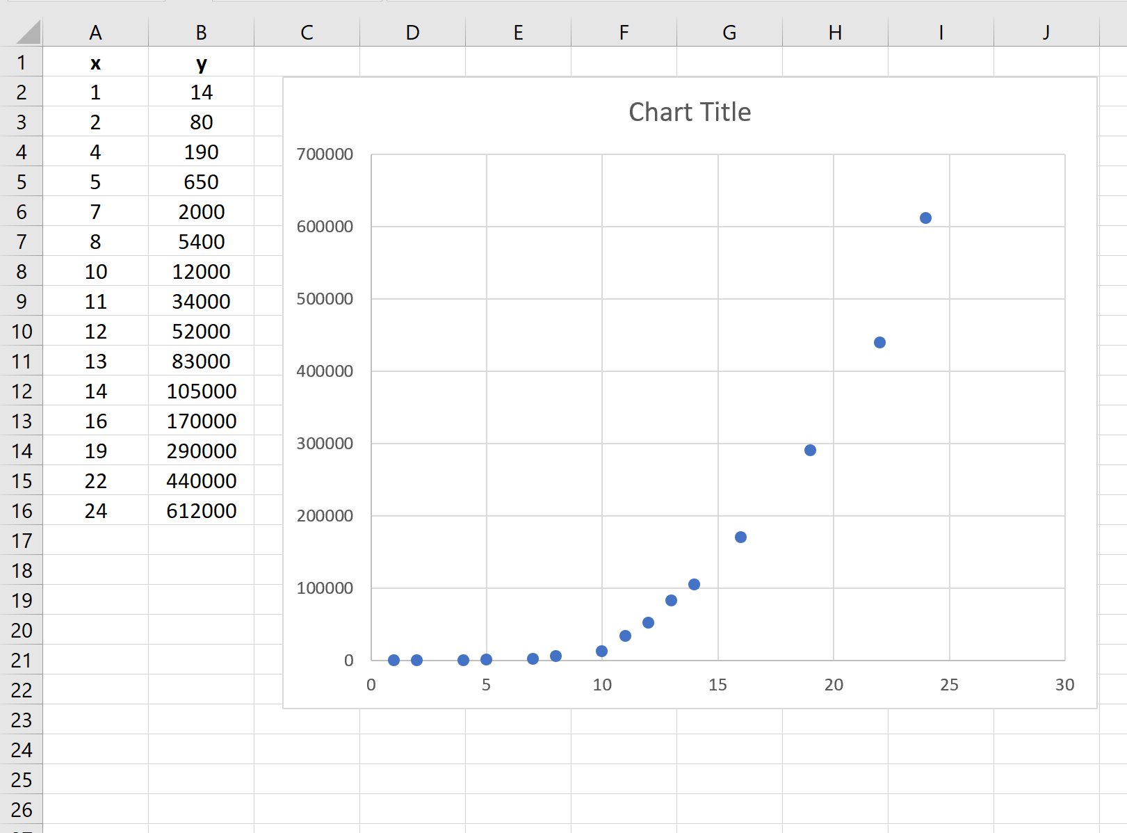
- Highlight the data in both columns. Go to the Insert tab and select ‘Scatter’.
- Right-click on the graph and select ‘Format Axis’. Under the Scale tab, select ‘Logarithmic scale’.
- Your semi-log graph is now ready. You can customize it further to make it look more presentable.
What is a Semi Log Graph in Excel?
A semi log graph in Excel is a graph that is used to display data over a wide range of values. This type of graph is especially useful when displaying data that has a large spread or range, such as population statistics or stock prices over time. The semi log graph allows for the data to be displayed in a more meaningful way, rather than simply plotting the data on a linear graph.
The semi log graph uses two separate axis scales, one for the x-axis and one for the y-axis. The x-axis scale is linear, while the y-axis scale is logarithmic. This allows for the data to be displayed in a more meaningful way that is easier to understand. The logarithmic scale allows for the data to be displayed in a way that allows for the viewer to identify trends or patterns more easily.
How to Make a Semi Log Graph in Excel?
The first step in making a semi log graph in Excel is to enter the data into the spreadsheet. Once the data is entered, it should be organized in columns, with the x-axis data in the first column and the y-axis data in the second column. It is important to ensure that any data that is entered is in numerical format.
Once the data is entered, the next step is to select the data that will be used to create the semi log graph. To do this, click on the ‘Insert’ tab and then select ‘Scatter Chart’ from the ‘Charts’ section. This will open up a new window that will allow you to select the data that will be used to create the semi log graph. Once the data is selected, the graph will be automatically generated.
Formatting the Graph
Once the graph is generated, it can be formatted to make it easier to read and understand. To do this, right click on the graph and select ‘Format Axis’. This will open up a new window that will allow you to change the settings of the graph. On the left side of the window, select the ‘Logarithmic’ option in the ‘Scale’ section. This will change the y-axis scale to a logarithmic scale, which is the key to making a semi log graph.
Once the y-axis scale has been changed, the graph can be further customized by changing the color, font, and size of the labels on the graph. This can be done by selecting the ‘Axis Title’ option in the ‘Format Axis’ window. The graph can also be further customized by adding a title and legend.
Saving the Graph
Once the graph is complete, it can be saved as an image file or it can be exported to a different format. To save the graph as an image file, click on the ‘File’ tab and select ‘Save As’. From here, select the desired image format and enter a file name. To export the graph to a different format, such as a PDF or Excel file, click on the ‘File’ tab and select ‘Export’ or ‘Save As’.
Conclusion
Creating a semi log graph in Excel is a relatively simple process. The key is to ensure that the data is entered in numerical format and that the y-axis scale is set to a logarithmic scale. Once the graph is generated, it can be further customized by formatting the labels and adding a title and legend. Finally, the graph can be saved as an image file or exported to a different format.
Few Frequently Asked Questions
Q1. What is a Semi Log Graph?
A semi log graph (also known as a semi-logarithmic graph) is a graph in which one axis is displayed on a linear scale and the other on a logarithmic scale. This type of graph is used to display data that has a wide range of values, as the linear scale is used to represent the small values and the logarithmic scale is used to represent the larger values.
Q2. How to Make a Semi Log Graph in Excel?
Making a semi log graph in Excel is relatively easy. First, enter the data you want to graph into the worksheet. Then select the data you want to graph and click on “Insert” from the ribbon menu. From the “Charts” group, select “Scatter” and then select “Scatter with only markers”. Right-click on the graph and select “Format Axis”. Under the “Scale” tab, select “Logarithmic Scale” and click “OK”. This will create a semi log graph in Excel.
Q3. What are the Advantages of a Semi Log Graph?
A semi log graph is useful for displaying data that spans a wide range of values because it allows both small and large values to be represented on the same graph. This helps to compare different values and spot patterns more easily. Another advantage of a semi log graph is that it allows exponential growth to be represented in a more straightforward manner than a linear graph.
Q4. What are the Disadvantages of a Semi Log Graph?
The main disadvantage of a semi log graph is that it is difficult to interpret the exact values from the graph because of the logarithmic scale. Additionally, the values on the logarithmic scale are not evenly spaced, which can make it difficult to accurately compare different values.
Q5. Are there any Alternatives to a Semi Log Graph?
The most common alternative to a semi log graph is a log-log graph. This type of graph uses both logarithmic scales, making it easier to compare values that span a wide range of values. Additionally, a log-log graph allows for more precise comparisons between different values than a semi log graph.
Q6. What is the Best Way to Learn More About Making Semi Log Graphs?
The best way to learn more about making semi log graphs is to practice creating them in a spreadsheet program such as Excel. Additionally, there are numerous tutorials and guides available online that provide step-by-step instructions for creating semi log graphs. Finally, many books and other printed materials are available that provide more in-depth information about creating these types of graphs.
Making a Semi Log Graph in Excel
Creating a semi log graph in Excel is a great way to visualize data and gain insights into trends and correlations. With just a few simple steps, you now have the power to create a semi log graph in Excel with ease. Whether you’re tracking stock prices or analyzing trends in customer data, a semi log graph can help you make sense of your data quickly and effectively.