


How to Plot Distribution in Excel?

Do you need to plot distribution in Excel but aren’t sure how? You’ve come to the right place! Plotting distribution in Excel is a relatively simple process, but it requires a few specific steps. In this article, we’ll take a look at how to plot distribution in Excel and how to maximize the utility of this powerful tool. By the end, you’ll be able to confidently plot distribution in Excel and use it to your advantage. Let’s get started!
Plotting a distribution in Excel involves creating a histogram. To do this, select your data and click the “Insert” tab. Choose the “Insert Statistic Chart” option and select “Histogram.” You’ll be able to adjust the data range, bin range, and other options to customize your histogram.
- Open Excel and select your data.
- Go to the “Insert” tab and click “Insert Statistic Chart.”
- Select “Histogram” from the list.
- Adjust the data range, bin range, and other options.
- Your histogram will be displayed.
What is a Distribution Plot in Excel?
A distribution plot in Excel is a type of chart used to show the spread of data. It is used to show the distribution of values across a range of data points. It is often used to identify trends and patterns in data, as well as to compare different sets of data. Distribution plots can be used to compare multiple distributions at once, allowing for quick and easy comparisons.
Distribution plots are useful for comparing data sets of different size, as they provide an easy way to compare the spread of the data. They can also be used to identify outliers or unusual values, or to identify trends in the data. Distribution plots are often used in statistical analysis and predictive modeling.
What Types of Distribution Plots Are Available in Excel?
Excel offers several types of distribution plots, which can be used to display different types of data. The most common types of distribution plots are box plots, histograms, and scatter plots. Box plots are used to show the distribution of values within a range of data points. Histograms are used to compare the distribution of data across different categories or groups. Scatter plots are used to show the relationship between two variables.
Box Plots in Excel
A box plot in Excel is a type of chart used to show the spread of data. It is used to show the distribution of values within a range of data points. The box plot is created by plotting five values: the minimum, the first quartile (Q1), the median (Q2), the third quartile (Q3), and the maximum. These five values are used to create a box, with the median (Q2) in the middle and the other four values at the edges. Outliers are also plotted as points, outside the box.
Histograms in Excel
A histogram in Excel is a type of chart used to compare the distribution of data across different categories or groups. Histograms are created by plotting the frequency of data points across a range of values. The frequency is represented by the height of the bar. Histograms are useful for comparing the distribution of data across different categories or groups, as well as identifying outliers and unusual values.
Scatter Plots in Excel
A scatter plot in Excel is a type of chart used to show the relationship between two variables. Scatter plots are created by plotting two variables on a graph. The x-axis is used to represent one variable and the y-axis is used to represent the other. The points on the graph are then used to display the relationship between the two variables. Scatter plots are useful for identifying trends and patterns in data, as well as for comparing different sets of data.
How to Plot Distribution in Excel
Plotting a distribution in Excel is a relatively straightforward process. First, select the data that you want to plot. Then, select the type of chart you want to create. If you are creating a box plot, you will need to select the five values that will be plotted: the minimum, the first quartile (Q1), the median (Q2), the third quartile (Q3), and the maximum. If you are creating a histogram, you will need to select the frequency of values you want to plot. Finally, select the appropriate options and click “Create” to generate the chart.
Steps for Creating a Box Plot in Excel
Creating a box plot in Excel is a straightforward process. First, select the data that you want to plot. Then, select the type of chart you want to create. Next, select the five values that will be plotted: the minimum, the first quartile (Q1), the median (Q2), the third quartile (Q3), and the maximum. Finally, select the appropriate options and click “Create” to generate the chart.
Steps for Creating a Histogram in Excel
Creating a histogram in Excel is a relatively simple process. First, select the data that you want to plot. Then, select the type of chart you want to create. Next, select the frequency of values you want to plot. Finally, select the appropriate options and click “Create” to generate the chart.
How to Interpret a Distribution Plot
Interpreting a distribution plot can be a challenging task. Different types of distribution plots can be used to show different types of data. Box plots can be used to show the spread of values within a range of data points, while histograms can be used to compare the distribution of data across different categories or groups. Scatter plots can be used to show the relationship between two variables.
When interpreting a distribution plot, it is important to consider the shape of the plot. A symmetrical distribution plot will have a bell-shaped curve, while an asymmetrical distribution plot will have a different shape. It is also important to consider the spread of the data points. A wide spread indicates a greater variation in the data, while a narrow spread indicates a smaller variation. Finally, it is important to consider any outliers or unusual values that may be present.
Few Frequently Asked Questions
Q1: What is Plotting a Distribution in Excel?
A1: Plotting a distribution in Excel is the process of creating a graph that illustrates the probability of a set of data values. Essentially, it is a graphical representation of the values and the frequency of occurrences of the data. It is important to visualize the data in this way to better understand its characteristics and to make decisions based on the findings.
Q2: What are the Steps to Plot a Distribution in Excel?
A2: The steps to plot a distribution in Excel are as follows:
1. Select the data you want to plot.
2. Select the chart type you want to use.
3. Add the data to the chart.
4. Adjust the chart options to customize the look and feel of the chart.
5. Add labels and titles to the chart.
6. Insert a trend line and/or confidence intervals.
7. Export the chart as an image file or save it in the Excel file.
Q3: What are the Different Kinds of Plots for Distributions in Excel?
A3: The different kinds of plots for distributions in Excel include: histograms, box plots, bar charts, scatter plots, line graphs, and pie charts. Each type of plot has its own advantages and disadvantages, so it is important to consider which type of plot best suits the data you are trying to represent.
Q4: How do I Create a Histogram in Excel?
A4: To create a histogram in Excel, you first need to select the data you want to plot. Then, open the Insert tab and choose the Histogram chart type under the Charts section. This will open a new window where you can customize the chart options. Once you are satisfied with the look and feel of the chart, you can insert the chart into the spreadsheet.
Q5: How do I Create a Scatter Plot in Excel?
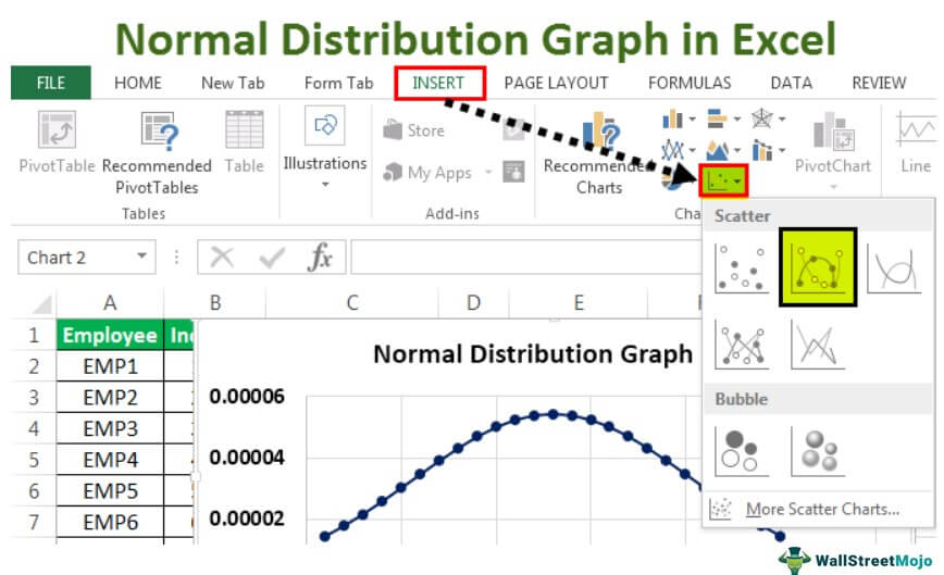
A5: To create a scatter plot in Excel, you first need to select the data you want to plot. Then, open the Insert tab and choose the Scatter chart type under the Charts section. This will open a new window where you can customize the chart options. Once you are satisfied with the look and feel of the chart, you can insert the chart into the spreadsheet.
Q6: How do I Add a Trend Line to my Distribution Plot?
A6: To add a trend line to your distribution plot, you first need to select the chart. Then, open the Chart Tools tab and select the Design tab under the Chart Layouts section. This will open a new menu where you can select the Trendline option. From here, you can choose the type of trend line you want to add to your chart. Once you are satisfied with the look and feel of the chart, you can insert the chart into the spreadsheet.
In conclusion, plotting a distribution in Excel is a simple process that can be completed with only a few clicks of the mouse. With the help of the chart wizard, you can easily create a graph that displays the data from your spreadsheet. When done correctly, the chart will visually demonstrate the distribution of data, which can be helpful for analyzing trends and making decisions about the data.