


How to Do Quartiles in Excel?

Are you looking for a simple way to calculate quartiles in Excel? Quartiles are used to divide data into four equal parts and are a key component of descriptive statistics. If you’re struggling to figure out how to do quartiles in Excel, we’ve got you covered! In this article, we’ll show you the step-by-step process of calculating quartiles in Excel, plus some helpful tips and tricks to help make the process easier. So if you’re ready to get started, let’s dive in and learn how to do quartiles in Excel!
Quartiles in Excel: Quartiles are used to divide a list of values into four equal parts. To calculate quartiles in Excel, use the QUARTILE.EXC function. This function requires two arguments: the array of values and the quartile you want to calculate. To calculate the first quartile, use the value 1, the second quartile use 2, and the third quartile use 3.
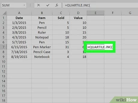
- Open your Excel spreadsheet and enter your data into a single column.
- Click on a cell, then enter the formula =QUARTILE.EXC(array,quart).
- Replace the “array” portion of the formula with the range of cells that contain your data. For example, if your data is in cells A1 to A20, your formula should look like this: =QUARTILE.EXC(A1:A20,quart).
- Replace the “quart” portion of the formula with the number of the quartile you want to calculate. For example, if you want to calculate the first quartile, your formula should look like this: =QUARTILE.EXC(A1:A20,1).
- Press Enter to calculate the quartile value.
What is a Quartile?
A quartile is a statistical measure of a dataset’s spread. It is the division of a group of data points into four equal parts. Quartiles are used to compare different sets of data and to study the underlying distribution of the data. Quartiles can be used to compare the range and variability of a data set.
Quartiles divide data into four equal parts, with each part representing a quarter of the data. The first quartile (Q1) is the median of the lower half of the data, the second quartile (Q2) is the median of the whole data set, and the third quartile (Q3) is the median of the upper half of the data. The fourth quartile (Q4) is the maximum value of the data set.
How to Calculate Quartiles in Excel?
Calculating quartiles in Excel is a simple process that can be completed in a few steps. First, enter the data into an Excel spreadsheet. Then, use the Excel QUARTILE function to calculate the quartiles. The function has three arguments: array, quart, and exclusive. The array argument is the range of cells containing the data, the quart argument is the number of the quartile to calculate, and the exclusive argument is a Boolean value that determines whether to include the maximum and minimum values when calculating the quartiles.
Example
Let’s say we have a data set of 10 numbers: 3, 5, 7, 8, 9, 11, 13, 15, 17, 19. To calculate the quartiles, enter the data into an Excel spreadsheet. Then, select an empty cell and enter the following formula: =QUARTILE(A1:A10,1,TRUE). This will calculate the first quartile (Q1). To calculate the second quartile (Q2), enter the following formula: =QUARTILE(A1:A10,2,TRUE). To calculate the third quartile (Q3), enter the following formula: =QUARTILE(A1:A10,3,TRUE).
Interpreting the Results
The result of the first formula is 8, which is the median of the lower half of the data set. The result of the second formula is 11, which is the median of the whole data set. The result of the third formula is 15, which is the median of the upper half of the data set. The fourth quartile (Q4) is the maximum value of the data set, which is 19.
Using Quartiles to Compare Data
Quartiles can be used to compare two data sets. For example, if two data sets have different quartiles, it could indicate that one set is more spread out than the other. In addition, quartiles can be used to compare the range and variability of a data set.
Using Quartiles to Identify Outliers
Quartiles can also be used to identify outliers in a data set. An outlier is a value that lies outside the range of the rest of the data. To identify an outlier, calculate the difference between the first and third quartiles, then compare it to the difference between the maximum and minimum values of the data set. If the difference between the quartiles is greater than the difference between the maximum and minimum values, the data set contains an outlier.
Using Quartiles to Identify Trends
Quartiles can also be used to identify trends in a data set. For example, if the first and third quartiles are increasing, it could indicate an overall upward trend in the data. Similarly, if the first and third quartiles are decreasing, it could indicate an overall downward trend in the data.
Related FAQ
What is a Quartile?
A quartile is a statistical term used to divide a set of data points into four equal parts, each part representing one-fourth of the total population or sample. Quartiles are important because they can be used to measure the spread of a data set and compare different data sets. The first quartile (Q1) is the point at which 25% of the data is below it, the second quartile (Q2) is the median of the data, and the third quartile (Q3) is the point at which 75% of the data is below it.
How Do I Calculate Quartiles in Excel?
In Excel, the Quartiles of a data set can be calculated using the Quartile() function. This function takes an array of numbers as its first argument, and an optional argument (0, 1, 2, or 3) that specifies which quartile should be calculated. If no argument is given, the function will calculate the median (Q2). To calculate the quartiles of a data set, enter the numbers in a single cell range and enter the following formula into a cell: =Quartile(Cell Range, Quartile Number).
What is the Difference Between Quartiles and Percentiles?
The main difference between quartiles and percentiles is that quartiles divide the data set into four equal parts, while percentiles divide the data set into 100 equal parts. Quartiles are useful for quickly summarizing the spread of a data set and comparing different data sets, while percentiles are more useful for finding the value of a particular data point within the data set.
What is Interquartile Range?
The Interquartile Range (IQR) is the difference between the third quartile (Q3) and the first quartile (Q1). It is a measure of the spread of the data and is often used as a measure of variability. It is calculated by subtracting Q1 from Q3. The IQR is useful in cases where the data is skewed, as it is not affected by outliers.
What is a Box Plot?
A box plot, also known as a box and whisker plot, is a graphical representation of a data set that displays the median, quartiles, and extremes of the data set. It is a useful tool for quickly summarizing the spread of the data. A box plot is made up of a “box” which contains the quartiles of the data, “whiskers” which extend from the box to the extremes of the data, and optional “outliers” which are values that lie outside of the whiskers.
How Do I Create a Box Plot in Excel?
Creating a box plot in Excel is fairly straightforward. First, enter the data into a single cell range. Then, select the Insert tab and click on the “Chart” button. Choose the “Scatter” chart type and select the “Smooth Lines with Markers” option. Finally, select the data range and click “OK”. Excel will automatically create a box plot with the quartiles, whiskers, and outliers marked.
Having a working knowledge of quartiles in Excel can be a major asset for any data analyst. As demonstrated, Excel offers a variety of formulas and functions to calculate quartiles. With a few simple steps, you can quickly and easily find quartiles for any set of data. Knowing how to do quartiles in Excel can help you quickly answer important questions and make data-driven decisions in your work.