


How to Make a Bar Chart in Excel?

If you’re looking to make your data visually appealing, then a bar chart is a great way to do it. Bar charts are an easy and effective way to display data and are commonly used in business presentations, research papers, and other data visualizations. In this article, we’ll show you how to make a bar chart in Excel, one of the most commonly used spreadsheet programs. We’ll walk you through the process step-by-step, so you can create beautiful, effective bar charts quickly and easily. Let’s get started!
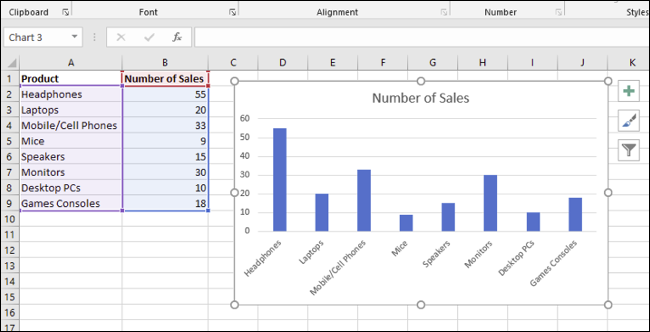
- Open your Excel spreadsheet and select the data you want to use for the chart.
- Go to the Insert tab and select Bar Chart from the Charts group.
- Choose from the various chart types and click OK.
- Your chart will be added to the worksheet.
- You can customize the chart by adding titles, data labels, and legends.
Understanding How to Make a Bar Chart in Excel
Bar charts are a great way to visualize data in Excel spreadsheets. They are easy to create, and they provide a quick overview of the data set. In this article, we’ll cover the basics of creating a bar chart in Excel and explain how to customize the chart to make it more meaningful.
Bar charts are a type of graph that illustrate the relationship between two or more variables. They are often used to compare data points over time or to show the relationship between two different variables. Bar charts can be used to visualize data from a spreadsheet, making them a great tool for data analysis and presentation.
Excel is an excellent program for creating bar charts. It has a wide range of charting tools that allow you to customize the look and feel of your chart. You can choose different colors, sizes, and styles to make your chart more meaningful.
Generating a Bar Chart in Excel
Creating a bar chart in Excel is easy. First, select the data that you want to visualize. You can select a single column or multiple columns of data. Next, click on the Insert tab, and then click on the Bar Chart icon.
The Bar Chart window will open, and you can select the type of chart you want. There are several different types of bar charts, including simple bar charts, stacked bar charts, and clustered bar charts. Once you have selected the type of chart you want, you can customize the look and feel of the chart.
Customizing a Bar Chart in Excel
Once you have generated a bar chart in Excel, you can customize the look and feel of the chart to better represent the data. You can customize the colors, sizes, and labels of the chart to make it more meaningful.
You can also customize the axes of the chart. For example, you can adjust the range of the y-axis to focus on a specific range of data points. You can also add labels to the x-axis to help describe the data points.
Adding Labels and Data to a Bar Chart
The labels and data points can be added to a bar chart in Excel. You can add labels to the bars in the chart, as well as labels for the x-axis and y-axis. You can also add data points to the bars in the chart to make it more meaningful.
You can also add lines to the chart to highlight certain data points. This can be used to show trends or relationships between different data points. You can also add a trend line to the chart to show changes over time.
Creating a Chart Legend
Excel also allows you to create a chart legend to help explain the data points in the chart. A chart legend is a box that is displayed next to the chart and contains labels and descriptions of the data points.
The legend can help to explain the meaning of the data points and make the chart easier to understand. You can customize the legend to include different colors and fonts to make it more visually appealing.
Saving and Exporting a Bar Chart
Once you have created a bar chart in Excel, you can save it and export it as an image file. This can then be used in other applications or for presentations. You can also save the chart as an Excel file, which can be used for further data analysis.
To export a bar chart, click on the File tab, and then click on the Save As option. Select the image file format you want to use, and then click Save. The image file will be saved to your computer. You can then use this file in other applications or presentations.
Few Frequently Asked Questions
Question 1: What is a Bar Chart?
A bar chart is a type of chart that uses rectangular bars to represent different values or categories. It is one of the most commonly used chart types, and is used to compare values across different categories. Bar charts are often used to visualize data, such as sales figures or population sizes. They can be used to compare values over time, or to compare two or more different sets of data.
Question 2: What are the Benefits of Using a Bar Chart?
Bar charts are useful for a variety of reasons. They can be used to compare values, identify trends, and visualize data. Bar charts are also easy to interpret and understand, making them ideal for presenting data to a wide audience. Additionally, bar charts can be customized to show different types of data, such as percentages, frequencies, or averages.
Question 3: How Do I Create a Bar Chart in Excel?
Creating a bar chart in Excel is a straightforward process. Begin by selecting the data you want to visualize, and then open the Insert menu. Select the type of chart you want to create, and then customize the chart to your liking. You can customize the colors, labels, and other aspects of the chart. Once you have finished customizing your chart, you can save it and share it with others.
Question 4: What Format is Required for a Bar Chart in Excel?
When creating a bar chart in Excel, you will need to format your data in a way that is suitable for the chart. Generally, your data should be arranged in columns or rows, with each column or row representing a category or value. The data should also be numerical; if your data is text-based, you may need to use an appropriate formula to convert it into a numerical format.
Question 5: What Type of Chart Should I Use for My Data?
The type of chart you should use for your data will depend on the type of data you are working with, as well as the purpose of the chart. Generally, bar charts are best suited for data that is categorical or numerical, while line charts are best suited for data that shows trends over time. It is also important to consider the audience you are presenting the data to; some types of charts may be more suitable for certain audiences than others.
Question 6: How Can I Customize My Bar Chart?
Customizing a bar chart in Excel is easy. You can customize the chart’s appearance, such as the colors, labels, and legend. You can also modify the size and shape of the chart, as well as the axes. You can also add annotations or other visual elements to your chart, such as trend lines or data points. Finally, you can add data labels to your chart, which can make it easier for viewers to understand the data you are presenting.
Making a Simple Bar Graph in Excel
Making a bar chart in Excel is an easy and straightforward process. With a few simple steps, you can create a professional looking graph that is sure to effectively communicate your data. Whether you’re a student, an employee, or a business owner, bar charts are a valuable tool that can help you make better decisions. So go ahead and give it a try – you won’t be disappointed!