


How to Use Kpi Visual in Power Bi?

Are you looking for an easy way to track and monitor the success of your business? With the help of Power BI, you can easily create KPI visuals to monitor key performance indicators (KPIs) and measure progress towards your business goals. In this article, we’ll explain how to use KPI visuals in Power BI, so you can get the most out of this powerful analytics tool.
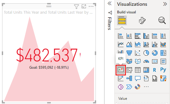
- Create a Power BI dashboard and select the KPI visuals option.
- Choose the KPI that you want to monitor, such as sales or profits.
- Set the target value for the KPI, such as a goal or budget.
- Add data to the KPI Visual, such as actual sales or profits.
- View the KPI Visual to monitor progress.
What is KPI Visual in Power BI?
KPI visuals are used to monitor key performance indicators (KPIs) in Power BI. KPIs are metrics that measure the success of an organization in meeting its goals. It helps to track the performance of an organization in terms of the goals set. KPI visuals help to visualize the performance data of an organization in a simple and easy to understand manner.
KPI visuals are used to measure the performance of an organization over time and provide insights into how the organization is performing. With KPI visuals, organizations can quickly identify areas of improvement and take action to improve performance. KPI visuals can be used to track the performance of individual departments, teams, and individuals.
KPI visuals can be customized to fit the needs of the organization. They can be used to track the performance of individual employees or teams. They can also be used to track the performance of an entire organization. KPI visuals can be used to create reports, dashboards, and visualizations that provide insight into the performance of an organization.
How to Use KPI Visuals in Power BI
KPI visuals can be used in Power BI to measure the performance of an organization. To use KPI visuals in Power BI, first, create a dashboard in Power BI. Once the dashboard is created, add KPI visuals to the dashboard.
The first step is to select the metric to be used for the KPI visuals. This could be any metric that is relevant to the organization, such as sales, customer satisfaction, employee satisfaction, etc. Once the metric is selected, select the KPI visual from the list of visuals in Power BI.
The next step is to configure the KPI visual. This includes setting the target value, setting the target range, and setting the color for the visual. Once the KPI visual is configured, it can be added to the dashboard.
The next step is to add the data to the KPI visual. This includes adding the metric and any other data that is necessary for the KPI visual to function properly. Once the data is added, the KPI visual will be ready to be used.
Benefits of Using KPI Visuals in Power BI
KPI visuals provide organizations with the ability to quickly monitor the performance of an organization in terms of the goals set. They provide insights into how an organization is performing and can be used to identify areas of improvement. KPI visuals can also be used to create reports and dashboards that provide insight into the performance of an organization.
KPI visuals are also easy to use and configure. They can be customized to fit the needs of the organization and can be used to track the performance of individual employees or teams. KPI visuals can also be used to track the performance of an entire organization.
Conclusion
KPI visuals are a powerful tool for monitoring the performance of an organization. They provide insights into how an organization is performing and can be used to identify areas of improvement. KPI visuals can be used to create reports and dashboards that provide insight into the performance of an organization. They can also be used to track the performance of individual employees or teams, as well as the performance of an entire organization.
Few Frequently Asked Questions
What is KPI Visualization in Power BI?
KPI Visualization in Power BI is a type of data visualization that helps to track the performance of a business or organization. It is used to measure the progress towards a specific goal or objective. KPI Visualization in Power BI is created by placing a KPI Visual on the Power BI dashboard, which can be found in the Visualizations pane. KPI Visuals can be customized to display various metrics such as sales, customer satisfaction, revenue, and more. The KPI Visual can also be used to compare performance against other organizations or competitors. Additionally, it can be used to compare performance across different areas or departments within an organization.
How Do I Create a KPI Visual in Power BI?
Creating a KPI Visual in Power BI is relatively simple. First, open the Power BI dashboard and select the Visualizations pane. Here, you will find the KPI Visual as an option to create. Once you select it, you will be taken to a new window where you can customize the KPI Visual by selecting the metrics you want to track and the parameters you want to measure. You can also customize the visualization by selecting the type of graph you want to display, the color scheme, and the size of the graph. Once you have finished customizing the KPI Visual, you can save and publish it to your dashboard.
What Can I Track with a KPI Visual in Power BI?
A KPI Visual in Power BI can be used to track a variety of metrics and performance indicators. Some of the most common metrics that can be tracked include sales, customer satisfaction, revenue, and market share. Additionally, it can be used to track the performance of different areas or departments within an organization. It can also be used to compare performance against competitors or other organizations in the same industry.
What Types of Graphs Can I Use with a KPI Visual in Power BI?
When creating a KPI Visual in Power BI, you can choose from a variety of graph types to display your data. These include bar graphs, line graphs, scatter plots, and pie charts. Additionally, you can customize the visualization by selecting the color scheme and size of the graph.
Can I Filter My KPI Visual in Power BI?
Yes, you can apply filters to your KPI Visual in Power BI. Filters are used to narrow down the data and display only the information that is relevant to your objectives. To apply filters, click on the filter icon in the top right corner of the visualization. Here you can select the parameters you want to filter by and the range you want to display.
What Are the Benefits of Using a KPI Visual in Power BI?
Using a KPI Visual in Power BI provides a variety of benefits. It helps you to track the performance of your business or organization and stay on top of your objectives. Additionally, it helps you to compare performance against competitors or other organizations in the same industry. It also allows you to apply filters to narrow down the data and display only relevant information. Finally, it helps to make your data more visually appealing and easier to understand.
KPI Visual in Power BI Explained
KPI visuals in Power BI can be a powerful tool to help organizations track their performance. By using KPI visuals, organizations can quickly analyze and understand their performance, identify areas of improvement and make more informed decisions. With Power BI, organizations can create meaningful visuals that help them make better decisions, improve performance and stay ahead of the competition.